DISCLAIMER: Due to privacy reasons, I can’t show the entirety of my work for this project. The following case study is a brief showcase of research methodologies, approaches to learning user perspectives, and design frameworks.
EvGO
Background
A self-configurable, lightweight subscription management solution tailored for small and medium businesses. Empowering business owners to effortlessly manage product catalogs, apply promotions, and access analytics — at their fingertips. This would bridge the gap for users whose needs do not demand the full enterprise platform.
Role
Lead Designer
Platforms
Web, iOS, watchOS, tvOS
Team
B. Kumar, Business Analyst
Yifan Du, Design Intern
Anudeep, Lead Engineer
Areas
Strategy, Design
User Story
For small and medium business owners, the platform needed to be a game-changer — simplifying tasks like managing subscribers, products, and payments. Whether the user is juggling multiple tasks or on the move, EvergentGo needed to have their back.
Our persona, Eric, is a motivational speaker who is traveling to his first sold out talk. He just remembered his e-book had to go live.
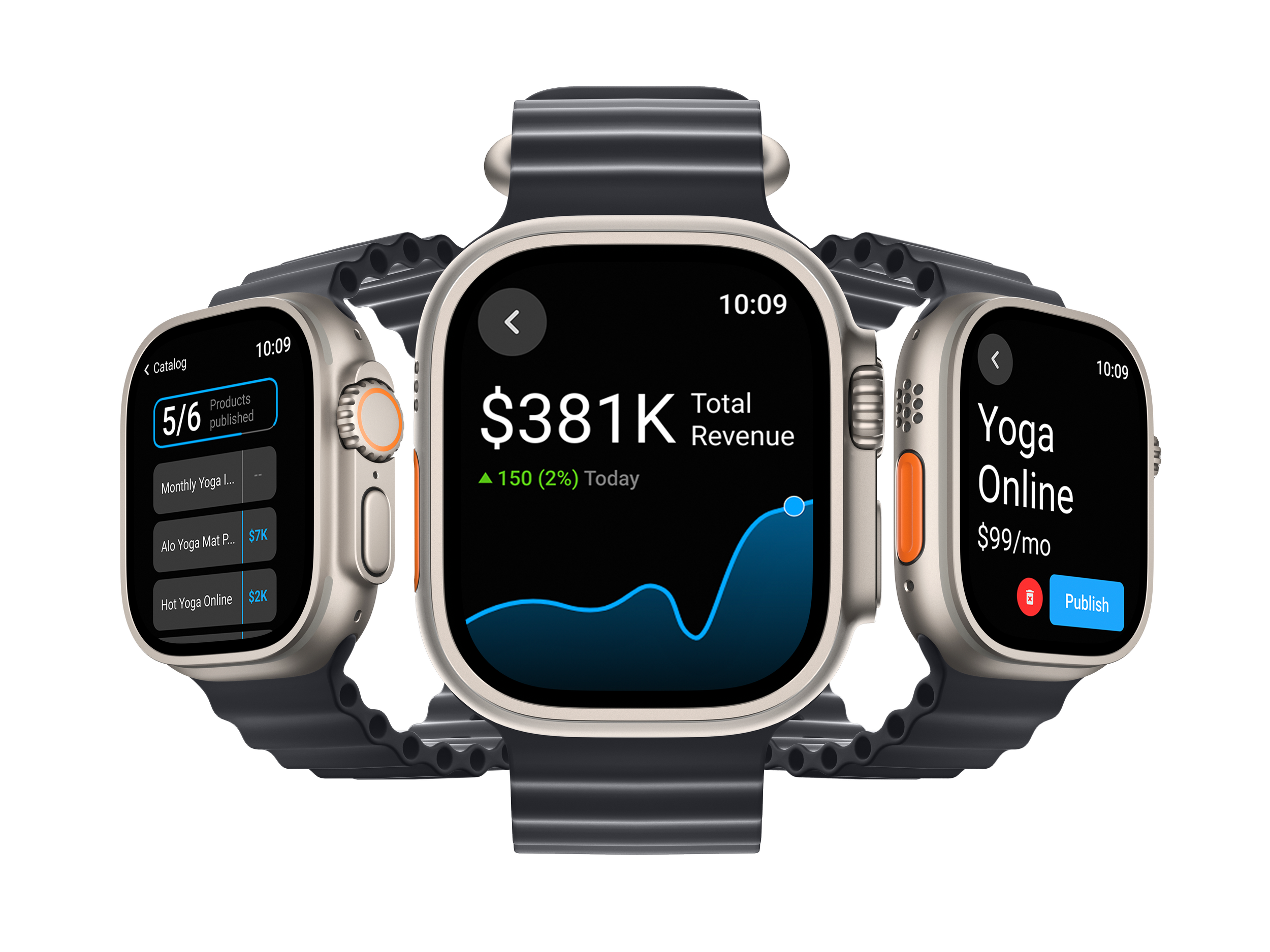
He schedules the launch through his smart watch.
Later in the day, back at his hotel, he sets up an offer for the audience about to attend the event.
He updates the product in no time, and adds an offer code to share at the talk when he promotes the e-book.
Weeks after the launch, on the move again, Eric tracks the product performance on the phone app.
While at his co-working desk, he uses his smart tv to share detailed analytics with his financial advisor.
Approach
My main aim for the research phase was to conduct wide stakeholder interviews, and run detailed usability tests on the first iteration. Recognizing the demanding schedules of business owners who often find themselves on the move, I prioritized accessibility and user-friendliness.
What if the user could easily update their product catalog, run promotions, and keep subscribers engaged—all from their phone, smart watch, or even their smart tv? No more being tied to a desk or struggling with complicated systems. It could be like having a personal assistant by your side, ensuring the user stays ahead of the curve no matter where inspiration strikes.
Multiple iterations were put to the test with users to obtain usability data, and for task flow improvements. We worked on integrating various gamification methodologies, like accomplishment badges, to enrich the experience.
Implemented the concept of an NLP Helper (© 2020) that would lead to an accelerated onboarding experience, make auto-fill suggestions, and learn about the business over time.
Dashboard focussed on an intuitive nested reporting section, and features like tasks, that aimed to reduce cognitive load and ease work flows.
Products under catalog are categorized and filtered with tags (top) to help with organization. Draft versus published cards on EvergentGO, and its equivalent product card on the end-user storefront (right).
Information architecture structured to make it easy to manage the business account.
From the beginning we conceptualized the platform from the perspective of a minimum viable device and scaled up from there. The smart watch and smart tv presented the platform as a companion to the web and phone versions. They answered our question: If we strip the platform down to its core, what remains? — analytics & catalog. This allows the user to launch products, and access data on the go.
Impact
After testing and a couple of iterations, we were successfully able to surpass our projections for efficiency improvements around the primary user pain points.
reduction in the total clicks taken to finish onboarding.
64.3%
decrease in the total time taken to sign up and onboard an user.
48.7%
Let’s chat.
If you have any questions or would like to discuss further details, please reach out.


